Welcome to another edition of Behind the Curtains! Today, we talk through our process of choosing color ways for our watch releases.
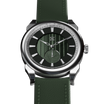
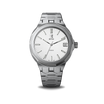
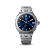
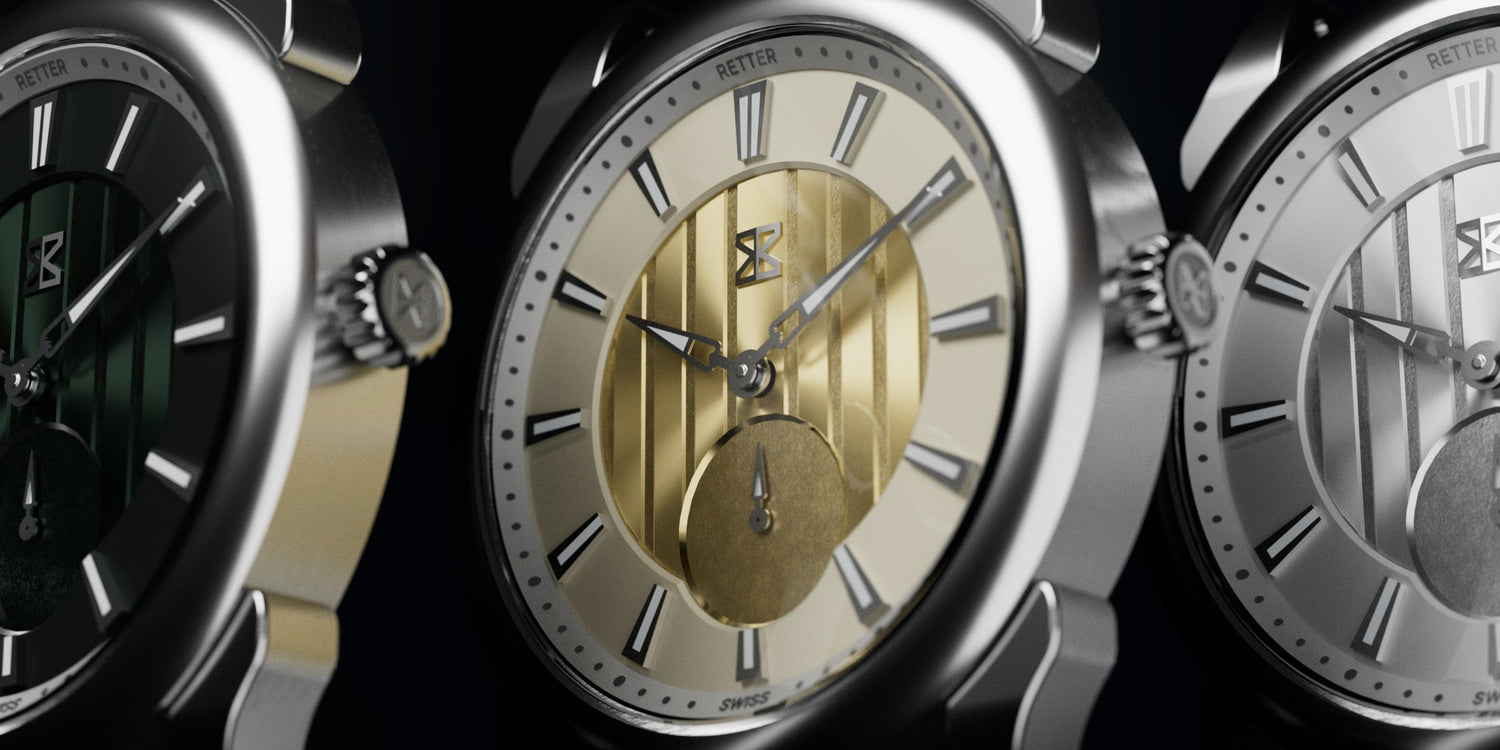
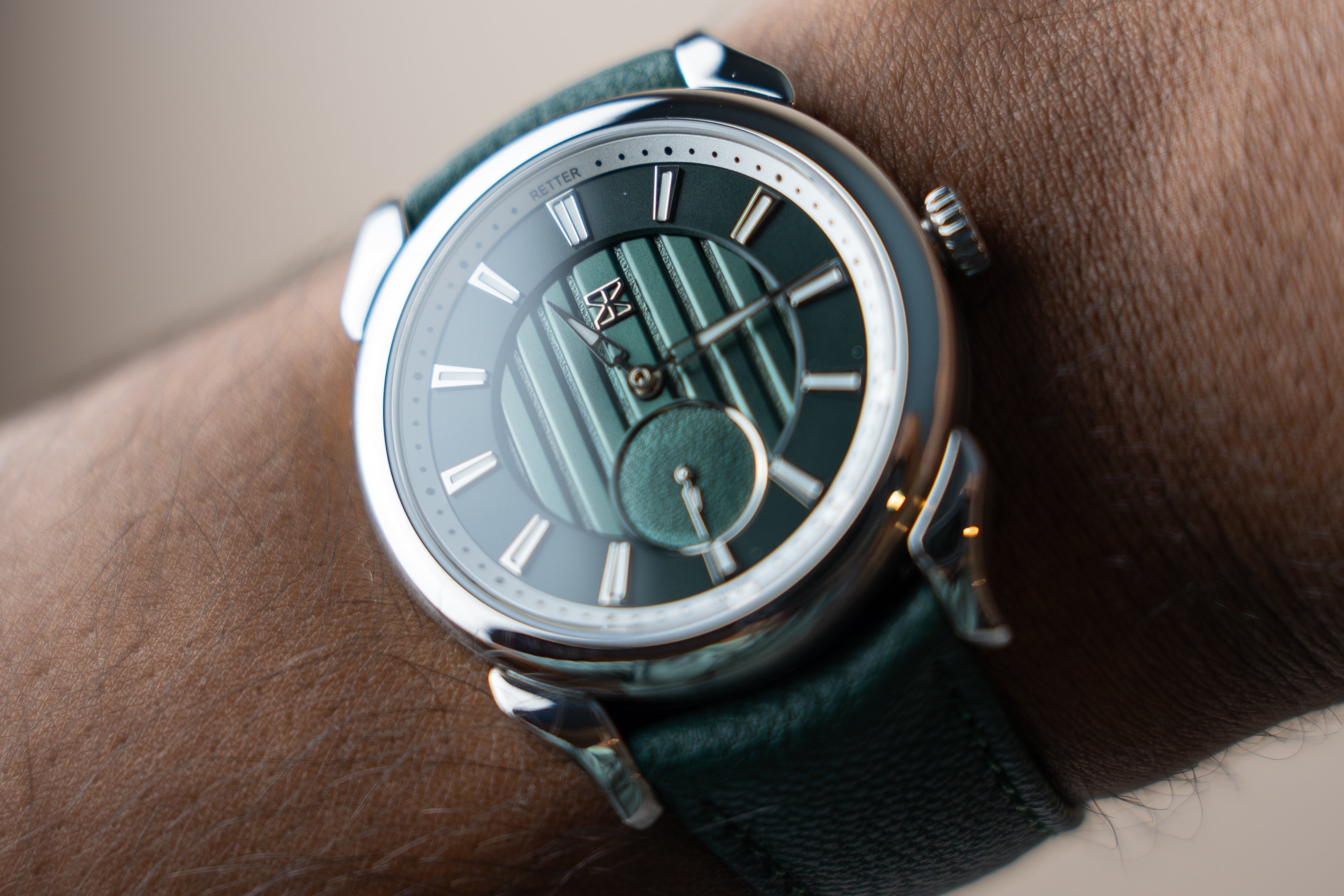
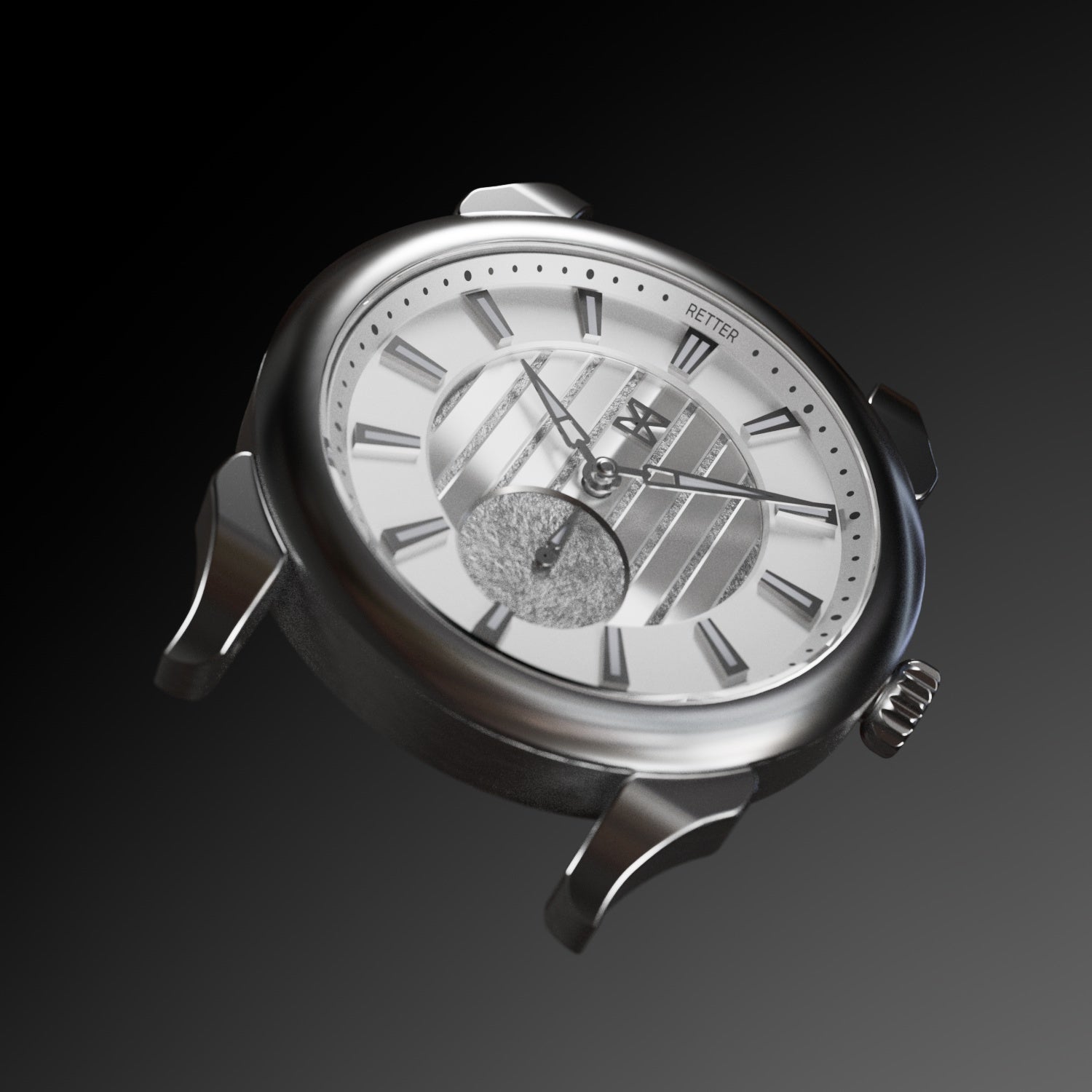
We launched Mistral in June 2024 with 3 colorways -- Midas Gold, Arctic Silver, and Pine Green. Part of the choice comes down to personal preference of myself (the founder) and our team, but there's a few other factors to consider too that most buyers might not think of.
Our approach to watchmaking has always been that we're enthusiasts first, and that we'll find other enthusiasts with the same collecting preferences as us who will like the watches we make. We prefer making watches that we'd like the wear and own rather than responding to trends in the market, as it's a more passionate and love-guided method.

That being said, we do think about what colors are more and less likely to do well. For instance, we had the idea to create a Mistral variant in deep aubergine purple -- an idea perhaps better reserved for a limited edition for our team rather than a public release.
We're held to some fairly high minimum order quantities by our suppliers, and ultimately, if we cannot meet them, it raises the cost for both us and our customers. It's no secret that watch development is expensive, and the better our watches sell, the more flexibility we have during our future development processes.

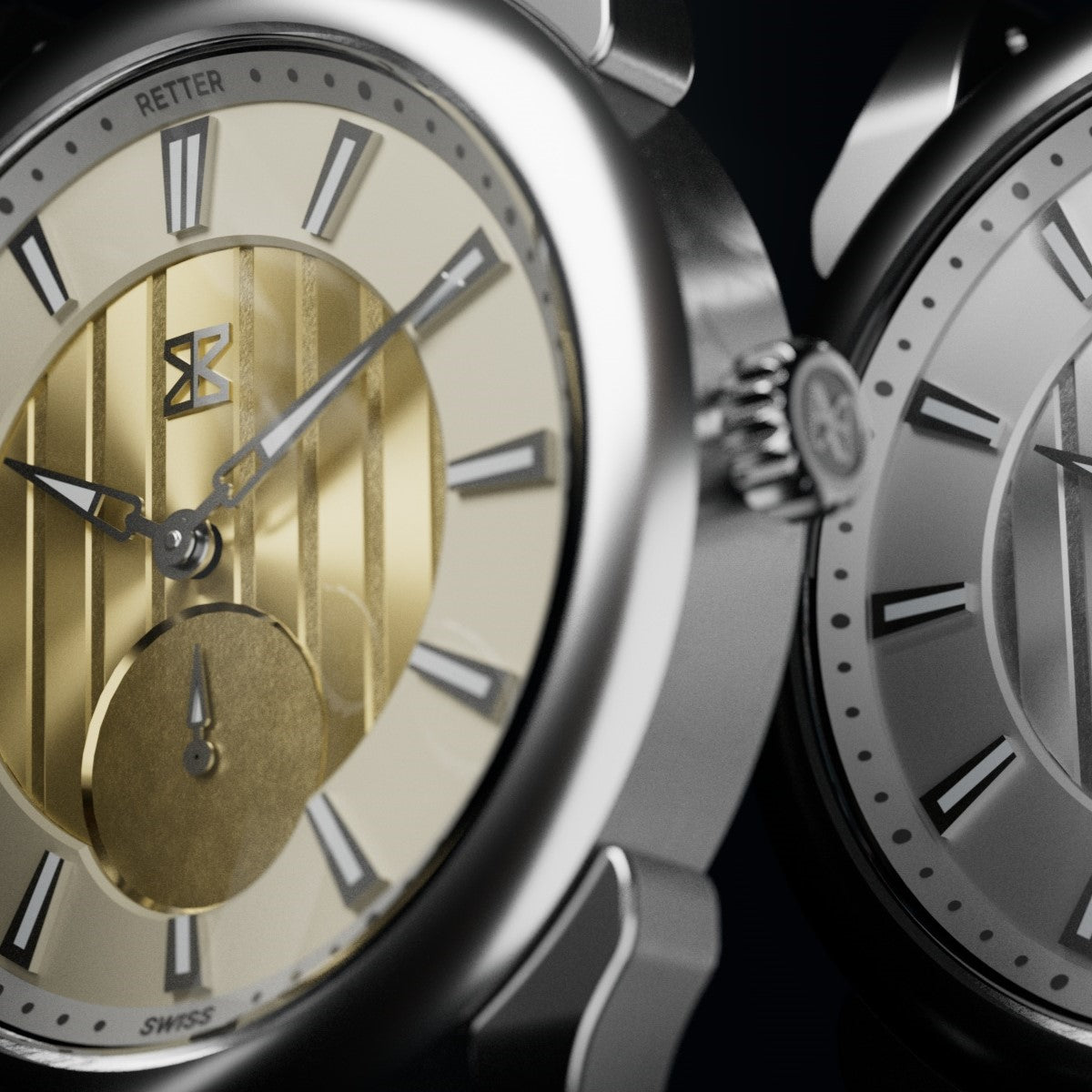
Another important consideration is material and manufacturability. For Mistral, we had long maintained that we wanted to utilize precious metals in some way. The vertical lines on the dial are reminiscent of gold and silver bars, and so we chose to use the real thing -- we used layers of gold and silver foil over those ridges, and the glistening appearance made the cost well worth it.
On top of being able to incorporate precious metals into the design, gold and silver are generally easy to work with and made the manufacturing process less error-prone and more straightforward.

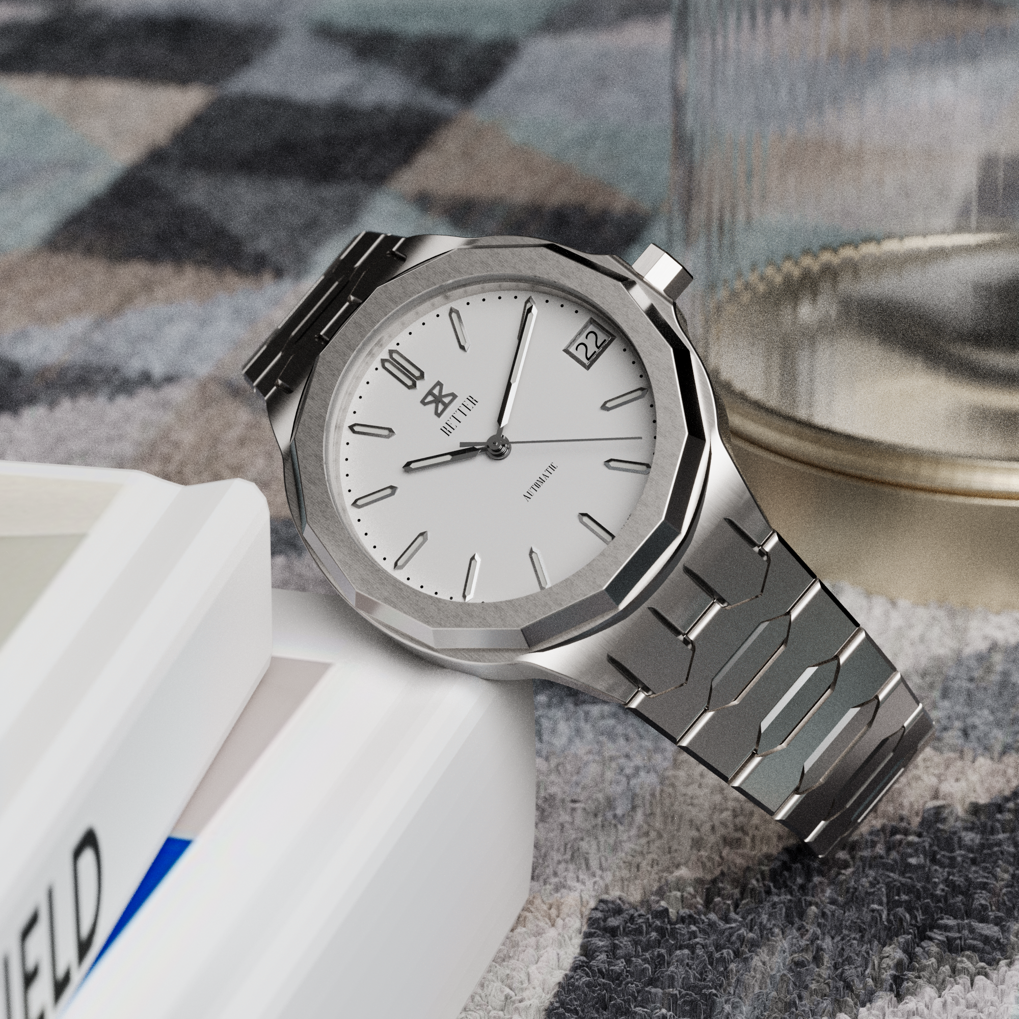
Lastly, we think a lot about how different colorways will photograph. Ultimately, watch buying from independents can be an impersonal experience -- most people will never see or handle the watch before they purchase one. This means that the colorways we choose need to have the ability to be photographed in a way that does it justice, and looks good in photos. How light will treat the dial is a huge consideration for us, and one that we test extensively in our rendering simulations.
These are the main factors we look, but I'll end with a pretty huge caveat. As I mentioned, being enthusiasts first and foremost means that we make watches that we'd want to wear. We put a huge weight on the preferences of our team, because if you don't make watches that you like and are passionate about, then what's the point?
Thanks for reading, and until next time.